I am a shoe girl…but of course you already knew this. 🙂

Whenever a new shoe-related beauty collaboration comes along, I’m always eager to try it on for size (haha!), even when the link between said footwear and whatever new perfume (Jimmy Choo) or palette (Seychelles for Smashbox) we’re talking about seems about as random as, I dunno, Ryan Gosling releasing his own line of Mrs. Grossman’s stickers, or Beyoncé launching a limited edition Mrs. Carter Dyson vacuum (as a side, I would totally want both of those things if they were real).
Generally, whenever makeup and shoes are involved, you can count me in, which is why I’m deeply fascinated with the new Pierre Hardy for NARS collection that strutted its stuff online today at narscosmetics.com with six nail polish duos and two powder blushes.
I didn’t know much about Pierre Hardy before this launch. I’d thought, “Is that Ed Hardy’s cousin?” (Kidding) But then I looked him up…
A French shoe designer originally trained in fine arts and dance, Hardy’s fashion career took off in 1988 when he designed his first shoe collection for Christian Dior. His heels and high tops often incorporate geometric elements, which I like. His aesthetic seems very chic to me, and yet it doesn’t seem to take itself too seriously.

Thematically, NARS borrows heavily from Pierre Hardy’s summer 2013 collection here, with a mix of orange, nude, blue, purple and gray, which weave their way into the polishes, while a pattern lifted from a bold cuff repeats itself within the two pans of over-sized blush.

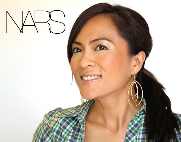
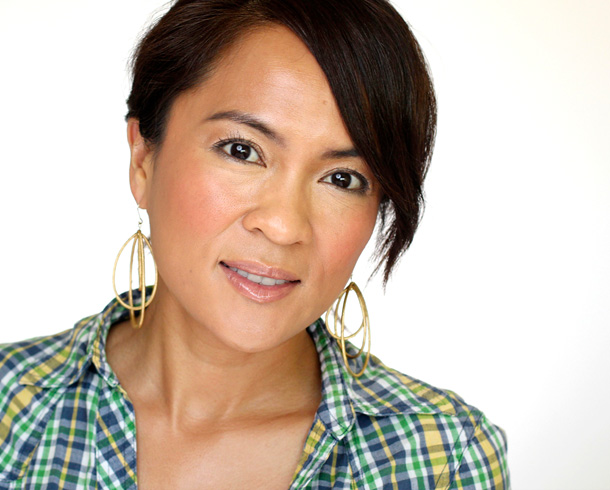
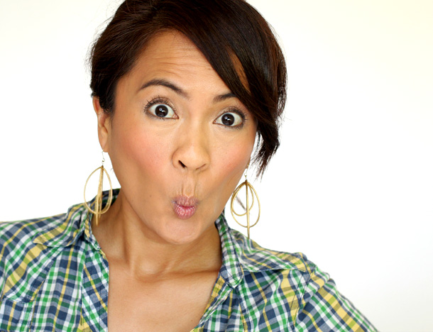
Last weekend I strapped on some leopard heels and took the blushes out for a walk.
At $41 each (for a 0.45-ounce pan), the two Pierre Hardy blushes are more expensive than usual for a NARS blush pan ($29), but they’re also considerably larger (0.45 ounces versus 0.16).
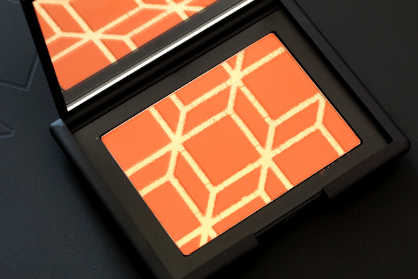
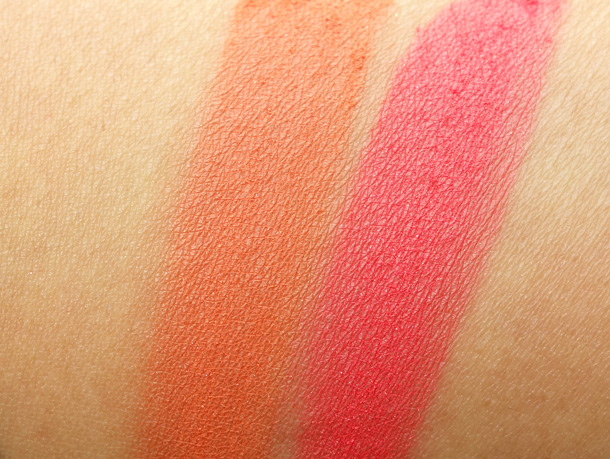
The orange shade, Rotonde, an electric tiger lily with a golden shimmer, wears an overspray, which when brushed away reveals a warm, pigmented terracotta orange.
One swirl of my blush brush in the pan of soft powder (that feels like expensive suede) delivers a bright cheek look that I can’t wait to see on warm, tanned skin, with a golden coral lip.
MAKEUP AND BEAUTY BLOG RATING: A+
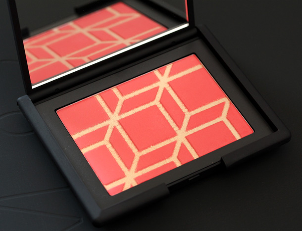
I also like — no, LOVE! — the reddish pink shade, Boys Don’t Cry, and not just because it’s the name of one of my favorite songs from The Cure.
A bright ruby red grapefruit pink with the same golden shimmer overspray that graces Rotonde, and like Rotonde, the blush is fine like powdered sugar. I barely have to use any at all for really bold cheeks.
Not streaky at all, it’s also a cinch to blend. For my darker-skinned gal pals, I can’t recommend it enough.
MAKEUP AND BEAUTY BLOG RATING: A+


Your friendly neighborhood beauty addict,
Karen
Now these are pigmented like crazy! I really love everything about it, the pattern, the shades (both!) and the finish. I think I like Rotonde a bit more on you tho, it’s just so perfect for you skin tone ^^. These are one of the few blushes that are actually that pigmented that they slightly scare me, lol!
Hi Teri,
You could do it! You just need a fan brush. 🙂
Oh great! Well I’m still on the look out for a decent fan brush, any recs?
These look gorgeous on you! Now I want both. haha, of course.
Thanks, Natalie!
Love!! I’ll unfortunately have to pass because of the…ahem…damage…to my checking account from recent purchases. But the “ruby red grapefruit pink” of Boys Don’t Cry is exactly the shade lip color I’m looking for! I’m hoping that Tarte Aqualillies Timeless is spot on.
Hi Alison,
Ah, I’d love that color for the lips too! Would you want it with or without the gold shimmer?
….both? 😀 If I can only choose one finish, here is my theory: Always go for matte/shimmer-free. Shimmer and glitter can be added later, but it can’t be removed!
They look pretty but I think they would be too bold for me. I tempted to get the nail polishes from this collection though.
You would literally only need half a swipe, and then you’d have to dilute, dilute, dilute! I imagine that a bold cheek could look really pretty on your pale skin if you blended the crap out of the edges — very Snow White-esque!
these are pretty but I’m soooooo disappointed the gold is an overspray.
Hi Liz,
Ya know, when I swept the gold away at first, I was kinda bummed, too, but the color is still equally as beautiful without it. You could always layer a shimmery gold highlighter if you want too!
I must have Rotonde! Thank you, Karen! =)
You’re welcome, Nicole. 🙂
Ohhhh these are so amazing! Sucks there is an over spray I love a little shimma shimmer to my blushes! Boys don’t cry is gorgeous, but not sure if it would pair well with the redness in my cheeks. Rotonde might be a better choice. Hmm either way I can’t wait to check these out 😜
Hi Bree,
I think that you can’t go wrong with either shade. Theres are both so pigmented and smooth…just lovely blushes! When NARS does it right, they REALLy do it right.
Hope you had a nice Monday. 🙂
Oo, love the geometric design!! I’ll have to check out Boys Don’t Cry!
Hi Sonya,
I hope you love it!
Oh these blushes are to die for! Such a punch of color! I love the gorgeous gold detail on it, and even though it doesn’t last they are still gorgeous. I would totally lean towards Rotonde in a heartbeat, but I’ve been so into warmed up orange/peachy blushes lately that my instincts say to think outside the box a bit and go for Boy’s Don’t Cry. 🙂 We shall see! They are both so flattering on you!
Thanks, Angie. I don’t think you can go wrong with either shade. You may need a fan brush, though, since they’re both so pigmented.
Love Boys Don’t Cry! I am flat broke though and my credit card balance is inching up…
Would also likely be inappropriate on my very very pale skin.
Hi Chelsea,
You could do it! You’d just need a fan brush, and very, very little product. Seriously, the pan would last you YEARS.
Oh, these look gorgeous! But I’m afraid they would be too pigmented and bold for my pale skin…
Hi Gio,
They’re certainly very bold colors!
I can’t decide which one I like on you more! They both seem SO SO pigmented! I still don’t own a NARS blush yet if you can believe it, but I’m tempted by both!
You have to change that ASAP. Start with Amour or Torrid. 🙂
These are really pretty – then again, it’s Nars, it’s blush, it’s obviously going to be awesome. 🙂
I absolutely would get the limited edition Beyonce Dyson, too.
Can you imagine that Dyson!? It would have to be totally blinged-out, of course. And maybe it would play Beyonce songs when you used it.
These are beautiful and the pan is huge! In Pierre Hardy news, I also had no idea who he was by my imagination went to Ed Hardy relatives (NOT kidding – HAHA!). Also, just looking at the pics of his shoes made the balls of my feet ache. 🙂
RIGHT? I kept picturing NARS going all vintage tattoos!
I’m picturing glittery Koi fish – I think that’s a good thing! 🙂
I really love Boys Don’t Cry! So pretty!
Super pretty!
Beautiful blushes! The entire look you created around the blushes is so very pretty!
Thanks, KP!
lovely! and really hoping you might review a couple of those nail duos for us… pretty please?
I love them both but they are beyond my budget for a blush 🙁 however, if I only need to choose one, it will be the Rotonde for my NC45 skintone.